
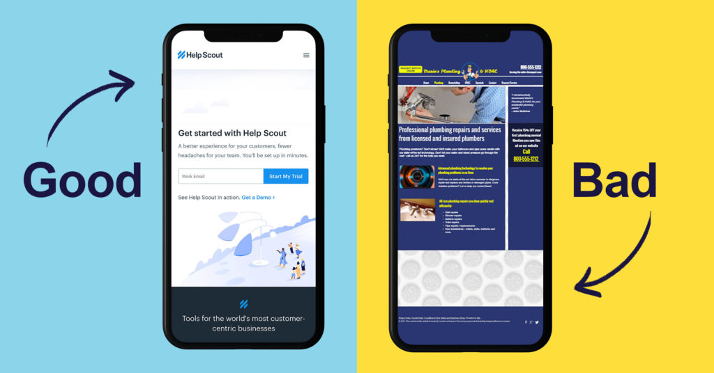
User experience plays a huge role in whether your traffic sticks around and coverts or hits the back button, never to return again. Users expect websites to be fast to load, smooth to operate, and easy to follow. Not only that, but they also expect your website to perform seamlessly no matter what device they are using to view it.
Statista published a study that shows mobile devices accounting for about half of all internet traffic worldwide. There’s no denying, a significant portion of your website traffic is coming from mobile phones and tablets. If your website isn’t designed to be responsive, mobile visitors will struggle to view content and navigate the site, which will likely cause them to bounce and choose someone else.
What is responsive web design?
Responsive website design is an approach that consists of fluid layouts, flexible images, and CSS media queries that allow a website to respond to different devices and screen sizes.
A responsively designed site automatically adapts to the screen it’s being viewed on, whether it’s a desktop computer, laptop, tablet, or smartphone. Rather than creating a different version of your website for each device type and screen size, responsive design allows you to create one website that responds to any environment.
How does responsive design work?
Web designers mainly use three types of functionality to create responsive websites:
Media Queries
Media Queries allow your site to inspect the physical characteristics of the device that is rendering it and alter its design based on those specific properties.
Flexible Grids
Flexible Grids cause columns to automatically rearrange themselves to fit the browser window or screen size.
Flexible Images
Flexible Images respond to different viewport sizes and display resolutions.
Why is it essential to have a responsive website?
User Experience
As we mentioned at the beginning of the article, websites with poor user experience have high bounce rates and low conversion rates. When mobile and tablet users view a non-responsive website that wasn’t designed for their device, they will have to manually zoom and scroll horizontally to view the content on your website. They may also have a hard time clicking links, menu tabs, and buttons because they are too small and close together to tap with their finger. If you have a video or animation that requires Adobe Flash Player, it will not work on a mobile device. These are just a few of the major ways that mobile users will have a poor experience on a site that is not responsive.
Search Rankings
In the past, when Google’s search bots crawled a site, they would only be crawling the desktop version of the site, even though many searchers were using mobile devices. For the last few years, they’ve been gradually rolling out mobile-first indexing, which means that the Google algorithm primarily uses the mobile version of a website when ranking the site’s pages. Google officially switched to mobile-first indexing for all sites on the web in September 2020.
Mobile performance has become a key ranking factor for search engines. Google knows that mobile users account for a large percentage of traffic and they do not want sites with poor user experience showing up in search results. That means a bad mobile site will hurt your overall search rankings.
How to test if your website is responsive
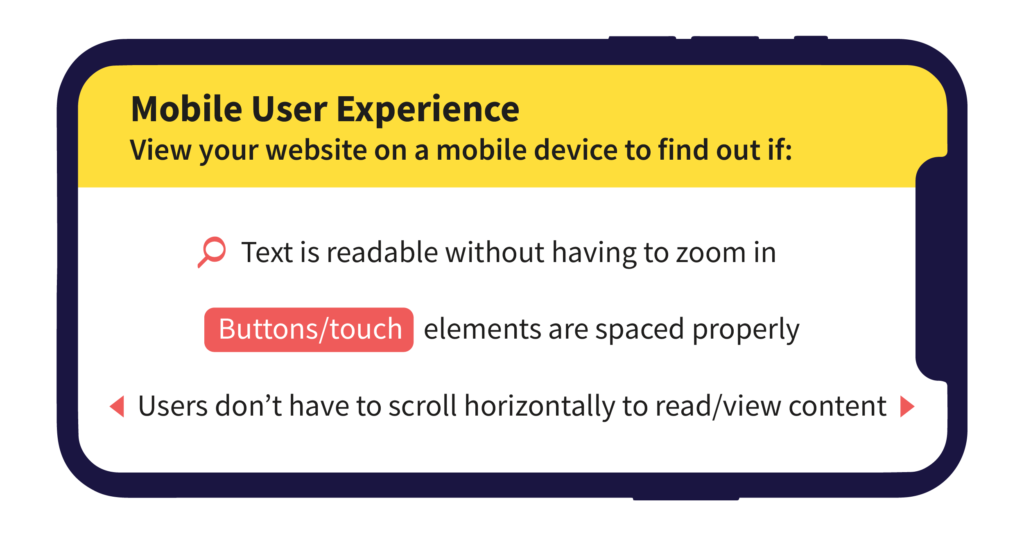
One easy way to test if your website is responsive is to view it on a desktop computer and reduce the window size of your web browser from full-screen down to a smaller size. If you can see the text, images, and menu items shifting around to fit the window size as it gets smaller, the site is responsive. You can also try Am I Responsive, a tool that allows you to input your URL and see what your website looks like on different devices.
Another helpful tool is Google’s Mobile Usability Report feature, which reveals your site’s specific errors and gives you information on how to fix them. Errors that may appear on your report include:
- Incompatible plugins (like Flash Player)
- Undefined viewport property
- Viewport not set to “device-width”
- Content is wider than the screen (requiring horizontal scrolling)
- Text is too small to read
- Clickable/touch elements are too close together
Responsive design examples for your inspiration
If you are looking for some inspiration, check out mediaqueri.es, a digital gallery of some of the best responsive web design examples on the internet.

Article by John Kennedy
Born and currently based in Lowell, Massachusetts, John is an impassioned copywriter and Olly Olly’s fearless Content Manager.
Like what you read? Send John a message here.